Your Cart is Empty
Free Shipping On Orders Over $100
Free Shipping On Orders Over $100
Where is your Brain?
Your brain is amazing. Select your country's website to access the world's best scientifically proven Brainfood.
Ārepa has a new look
2 min read

We're for brains
Ārepa has been working hard with our creative partners Previously Unavailable and Simon Endres over the past 8 months, updating our brand identity to reflect the values we hold in the company.
The previous brand identity has been great for us, as we needed to stand out from others and show our authority as a leader with solid scientific backing.
We have wanted to build on this with our new identity, keeping the scientific
authority while making us feel more accessible and recognisable to people on the global stage.
Our brainifesto
When your brain works better, you work better. You’re calmer, clearer, more focused and more productive. You might not know it, but you’re not a slave to the state of your brain. Like anything in your body, you can make it better.
At Ārepa, everything we do is for brains – from our scientifically formulated brain nutrition to our mission to teach people more about their brain and how to treat
it right, we work to make brains work better.
Our name
Ārepa is a Te Reo Māori transliteration of the word alpha. Alpha means many things, but to us, Ārepa is the unique frequency of alpha waves found in the brain related to the state of 'effortless alertness' when performing a task, psychologists call this state 'flow'. It is this frequency that inspired us to create Ārepa, a product that could help enable great achievements through Mental Clarity.
At the heart of it, the reason for using the name 'Ārepa' was to link our scientific grounding, which is the foundation of anything that we create, to our unique New Zealand cultural identity and honour tangata whenuatanga - indigeneity
Wordmark

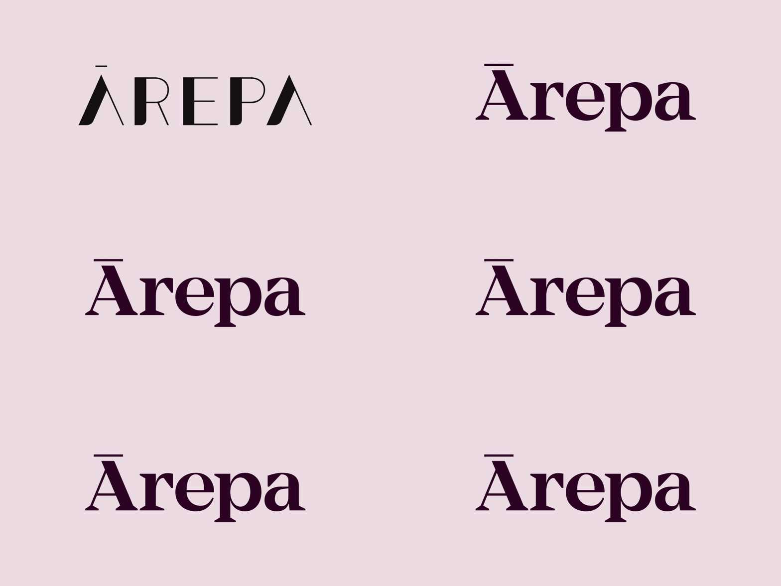
We wanted to make sure we paid respect and help elevate to the word Ārepa. By capitalising the Ā we are paying respect to the importance to the word itself while also linking it to the peak symbol below. The capital Ā also carries scientific authority which is fundamental to everything we do. The wordmark has been optically kerned for use at small sizes on packaging. Small design detail shifts have helped to add more strength and precision to the Peak and wordmark.
Symbol

The peak symbol follows the shape of letter A from the wordmark. The shape has been designed to emphasise the macron. The peak symbol is to represent the optimal peak state of your brain after drinking Ārepa, also linking us to the whenua (land) and the maunga (mountains) of Aotearoa - New Zealand.
Colours

The brand colour palette is derived from the colours found in the Ārepa drink. The inclusion of ruby red came about by pouring the drink out in small quantities and matching with a Pantone swatch. This method has led to a colour palette that includes the spectrum of colours found in the Ārepa drink.
Packaging
We have new packaging design to be released shortly and will be on shelves in no time. We are keeping it secret for now...
We hope you like our new direction as much as we do. We are excited to have a brand that echoes our mission:
To make brains work better!
Leave a comment
Comments will be approved before showing up.


